
As a Rock Star coach for over a decade, I've now worked with hundreds of investors, and something that I consistently find with people new to real estate investing is they often fail to "Zoom Out".
What I mean by that is often when people analyze a real estate deal, a stock, or other investment opportunities, they often look at past performance and use a chart to visually graph the data.
To get a complete picture of the performance of the investment, you would look back at the 1-3-5 year charts, possibly even further, to see how it's performed in different time periods to give you full context.
However, many new real estate investors analyze deals strictly by looking at the past 3/6/12 months worth of data which often blinds them to the long-term trend.
Real Estate is much less “liquid” than stocks, so it’s even more important to look at a much longer time horizon when analyzing a deal!
Take a look at this chart of the Toronto Real Estate Board's average detached home price in 2017.
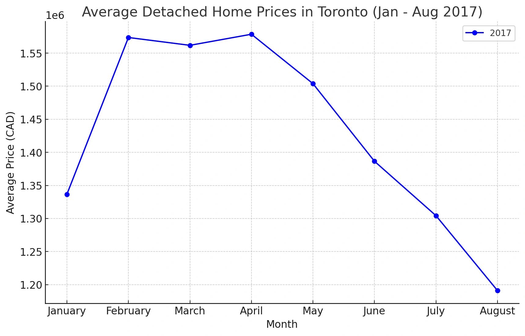
As you can see, while there have been multiple years with short-term pricing fluctuations, the trend into 2017 is massively up.
I chose 2017 as it’s one of the more recent examples of a notable price drop ( due to the introduction of the government's “Fair Housing Plan”), and subsequent recovery.
After the 2017 recovery, the housing market chugged along quietly outperforming most other investments until Covid hit.
And we all know what happened next!
The Covid-19 pandemic in 2020 had an abnormal impact on the housing market, as with the massive drop in mortgage interest rates, and the almost “free” money, housing almost immediately became the go-to for investors and the average individual which drove up prices artificially.
It’s now been 2.5 years since the first “Post Covid era” interest rate hike and things have been stable for a while now.
So what does it look like if we take that Covid run-up out of the equation?
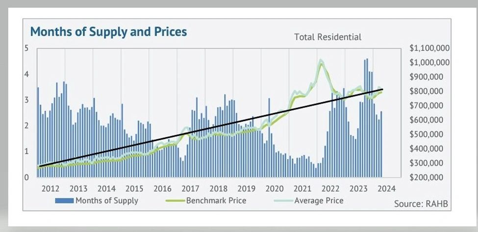
As you can see, if you had purchased pretty much anytime along that timeline (other than at the peak of the market) you would be sitting pretty.
For those who did happen to purchase at the peak, using some actual examples, let’s take a look at when we can expect to get back to those prices.
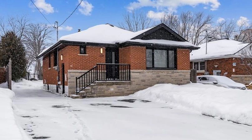
This Legal Duplex in Hamilton sold for 1,022,000 back in January of 2022.
A similar duplex today would sell for approximately $850,000.
At face value, that seems pretty scary, but similar to stock investing – it’s only a loss if you sell!
Sophisticated investors with a longer time horizon ignore these short-term fluctuations as they are playing the long game.
Using the trend data, let’s predict how long this property takes to get back to its “peak” value.
Using the RAHB data from 2001 through 2019 (pre-pandemic), the average annual appreciation in Hamilton is approximately 7.5%.
That means that assuming we go back to the trend, the 850,000 duplex should hit the original 1,022M in 2.5 years from today – less than 5 years from the initial purchase.
If you extrapolate out to the full 5 years of ownership (Jan 2027), the value should be 1.055M – a small profit – but a profit nonetheless!
Let’s look at ALL the details though over 5 years.
Let’s assume zero cash flow.
If you factor in mortgage paydown, and the small amount of appreciation, the Return on Investment on this worst-case scenario property is 53%, or 10.6% Average Annual Appreciation.
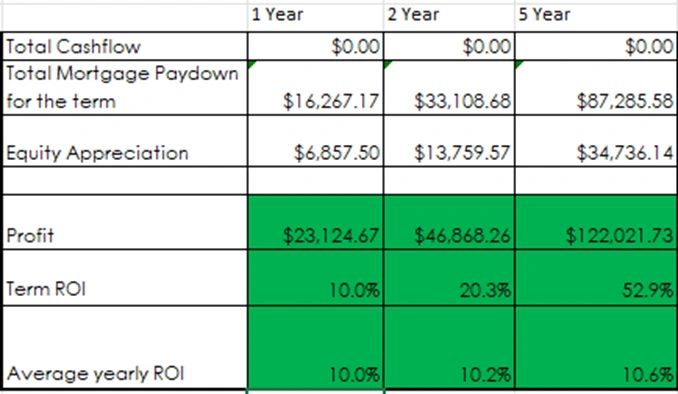
This is pretty close to the target of many financial planners!
Not bad for buying this property at the absolute worst possible time in the last few decades.
Let’s fast forward another 5 years assuming we keep to the average of 7.5
The 1.055M property grows to over 1.5M, and the average annual appreciation jumps to 47%.
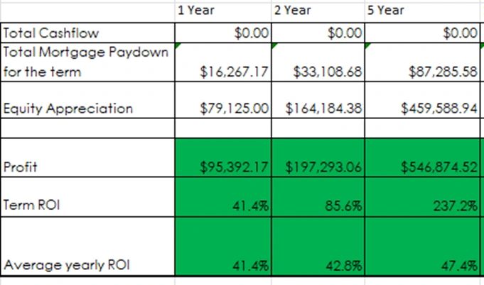
So as you can see, even those who unknowingly purchased Investment Real Estate at the absolute “worst” time, will experience amazing returns assuming they hold onto the property long enough.
This is why it’s so important to understand that unless you’re in the “business” of real estate and are looking to flip properties, or build homes, the short-term trends are really not something to pay much attention to.
As long as you’re looking at properties that have positive cash flow (lots of those out there these days!), in good areas, that will attract great tenants, they will chug along slowly in the background setting you up for an amazing future.
Not only that, but as the push for more affordable housing and greater density increases, more and more municipalities will be offering incentives to homeowners and investors alike to add basement suites, and ADUs (accessory dwelling units/garden suites).
As I write this the city of St. Catharines is offering up to $80,000 of FREE grant money to investors building garden suites.
This means that as an investor holding property for the long term, the opportunities to raise cashflow and force even more appreciation will continue to increase over time
This is why I always recommend that investors buying Real Estate should be looking to hold the property for at least 5 years if not 10, 20, or even 30!
So remember – ZOOM OUT!